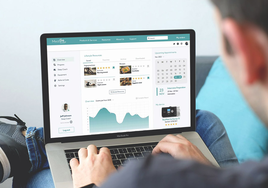
MediGo Sleep
How might we ensure sleep apnea patients feel confident they have all the information they need pre and post-treatment through the utilisation of supportive services?
PUBLISHED
January 2023
TYPE
Website
INDUSTRY
Education
01
Roles
- UX Research
- UX Design
- Interactions Design
This team project was part of a 6-week sprint within a UX/UI Design Bootcamp at Academy Xi.
I was involved in user research, the development of the user flow, and the design of the high-fidelity dashboard prototype. In this case study, I will share my specific work and contributions to the project.
02
Introduction
MediGo is a healthcare start-up that focuses on making it easier for Sleep Apnea patients to access affordable products and services without the hassle of booking and traveling to far-off locations, all while maintaining top-notch service quality.
Goal
Our UX/UI team’s goal was to design a platform that offers a dependable and supportive experience, guiding patients through testing, trialing, and purchasing equipment, as well as booking, payment, and healthcare management within a comforting and informative environment.
03
Research
As part of the user research, I attended user interviews conducted via Zoom. I assisted by taking notes and summarizing the information provided by the users.
The objective of our research was to discover the following:
- Assess patient awareness and understanding of sleep disorders.
- Identify barriers and concerns that hinder treatment-seeking.
- Evaluate the impact of education and continuous care on early intervention and treatment compliance.
After each interview, I would review the generated transcript. Reading the transcription alone was not enough, as the automated process often resulted in inaccuracies. Therefore, I also had to watch the videos to ensure that I didn’t miss anything important.
For each interview, I identified common themes and added them to Miro. As a team, we all contributed to creating this affinity mapping to identify our main insights.
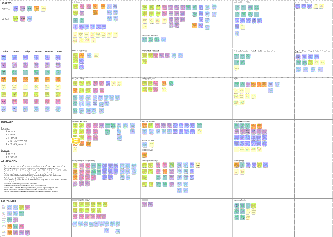
Creating an affinity mapping was helpful to our research because it allowed us to:
- Identify common pain points, needs, and goals among users.
- Discover insights and opportunities for improving the user experience.
- Build empathy and understanding of user perspectives.
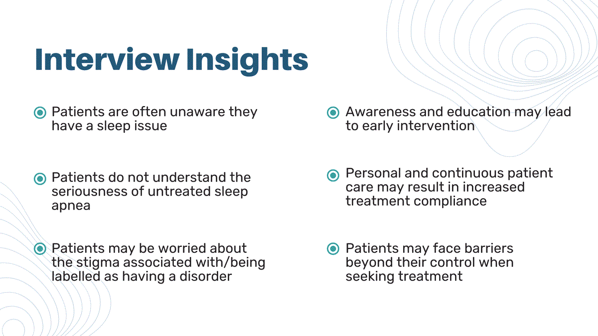
We combined this information with the data from the team responsible for the quantitative research. This allowed us to identify our users, and we realized that there are two types of users:
- Compliant users, who proceed with the recommended treatment.
- Non compliant users, who decide not to go ahead with the treatment.
04
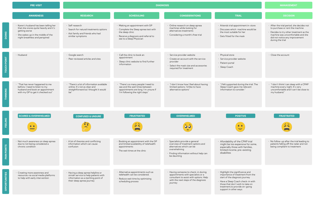
Customer Journey
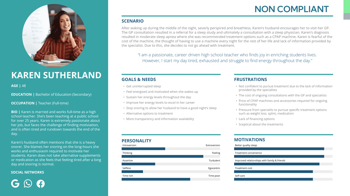
We decided to separate our team into two parts: one for compliant users and one for non compliant users.
I was in the non compliant user group. I created the template for our persona and customer journey and worked together as a team to complete it.
05
Ideation
During the Ideation part of our project, we wanted to turn the challenges and user needs we found into chances to craft a solution. We came up with a “How Might We” statement to help us think of new ideas to solve the problem.
How might we ensure sleep apnea patients feel confident they have all the information they need pre and post-treatment through the utilisation of supportive services?
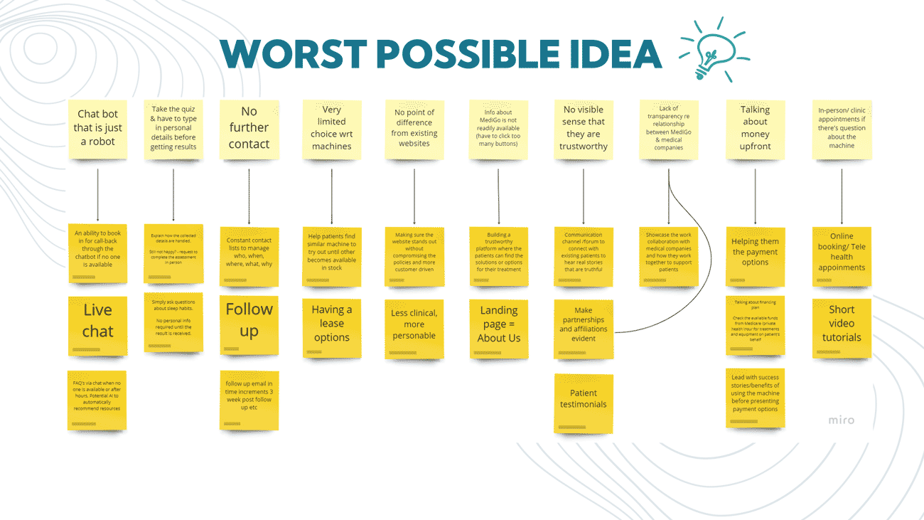
We did a “Worst Possible Idea” exercise during one of our team meetings. It was a fun and exciting way to think differently about our design.
By sharing really bad ideas, we could see what not to do and also find some interesting ideas we hadn’t thought of before.
06
User Flow
We developed a user flow for Karen, our non-compliant user diagnosed with moderate sleep apnea who decided not to proceed with the treatment due to costs. Our goal was to turn Karen into a compliant user with MediGo’s help.
The user flow involved Karen discovering financing options, taking a free online sleep assessment, visiting a GP, getting a referral for a sleep study, being diagnosed by a sleep physician, and selecting a MediGo Sleep Coach for treatment, all facilitated by the MediGo platform.

07
Wireframes and Prototype
We divided our team to create wireframes for our platform, keeping in mind both users and their respective user flows.
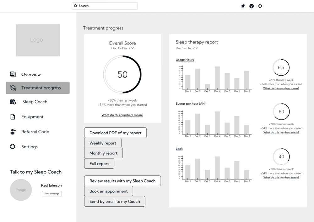
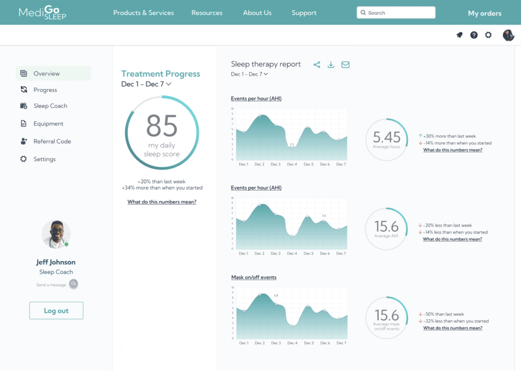
Based on the frustrations and goals of our users discovered during our research, I designed a wireframe for Paul’s Dashboard and Treatment Progress.
To create the Dashboard, I took the following into account:
- A simple menu to prevent users from feeling overwhelmed by too much information.
- One-click option to chat with a Sleep Coach, addressing the user’s need for guidance.
- Lifestyle Resources (Yoga Practices and Recipes) to help users improve their lifestyle and manage weight.
- A sense of accomplishment by displaying Events per Hour statistics related to CPAP therapy.
- Easily view, modify, or cancel Upcoming Appointments on the dashboard for continuous support.
- Access to tutorials and personalized support for the CPAP machine, reducing fear and anxiety.
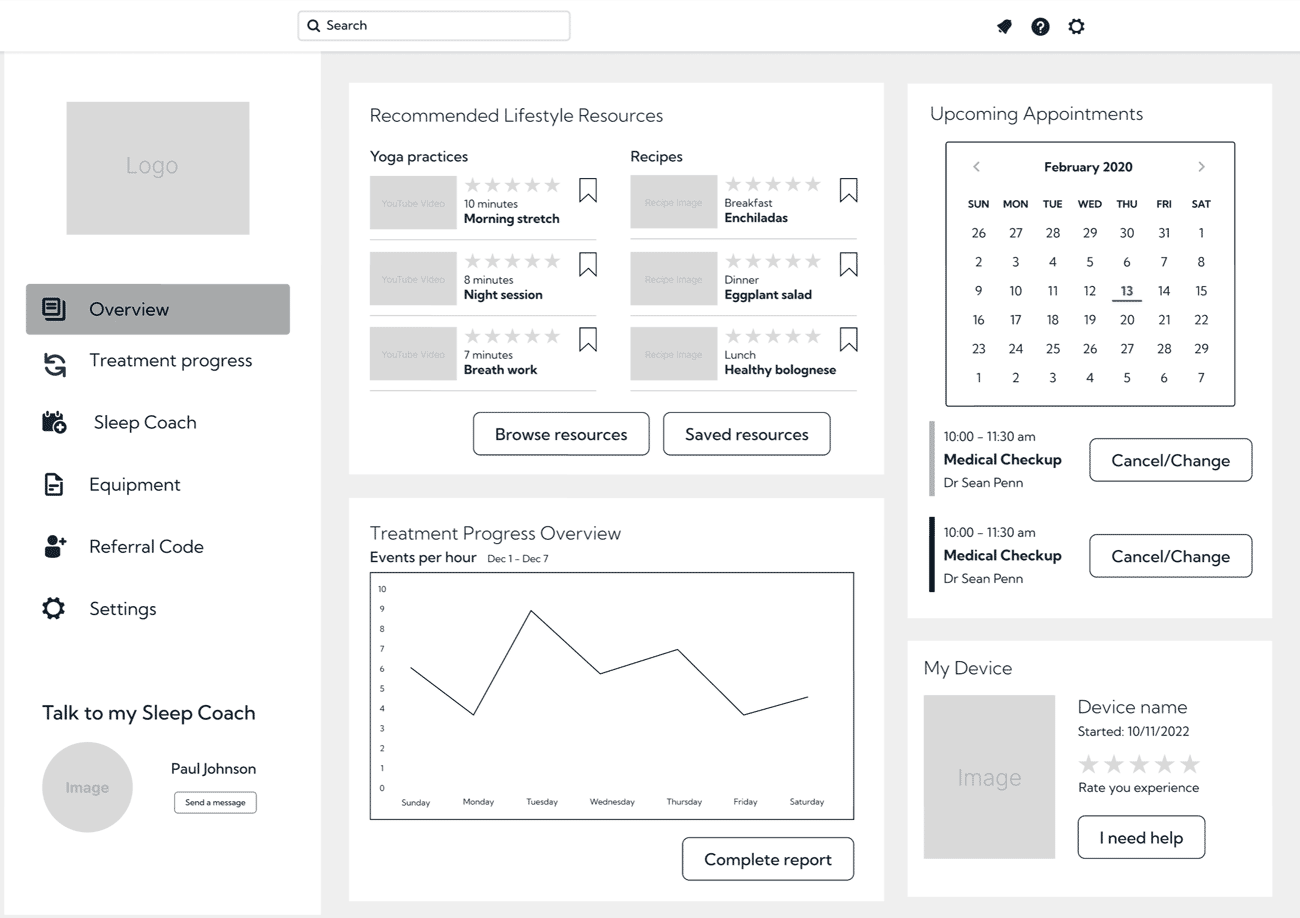
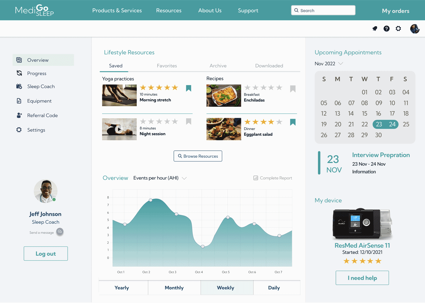
The dashboard includes a section that displays the user’s “Treatment Progress” and provides a sleep therapy report.
To design this section, I conducted research on sleep apnea reports available on the internet. While these reports can be complex, my aim was to make the visualization of the report easy to understand for the user and give them a sense of achievement.
It’s important to note that if this project were to be implemented, we would need to have constant communication with the client to ensure we accurately represent their needs.
11
What I learned
Throughout the Medigo project in my Bootcamp, I gained valuable insights and lessons. Here are the top 3 takeaways from my experience:
Investigating sleep apnea, a complex topic I had never heard of before, was essential to understanding the needs of our users. Diving deep into research helped me grasp the challenges faced by patients and medical professionals.
I learned the importance of ongoing iteration, like when designing the dashboard. I had to go back to the research phase to understand how sleep apnea machine reports work, ensuring that our solution aligned with users’ expectations and needs.
Working on this project taught me to be flexible and adapt to new information as it became available. It was a continuous learning process that required open-mindedness and a willingness to pivot when needed.
