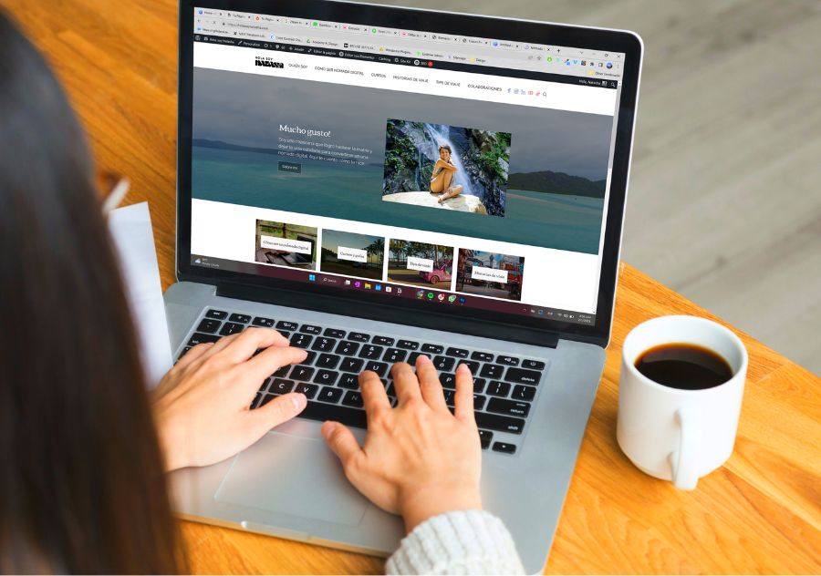
Hola, soy Natasha
How might we provide clear and actionable information, relevant courses and resources to help aspiring digital nomads navigate the complex world of remote work, while also generating revenue?
PUBLISHED
January 2023
TYPE
Website
INDUSTRY
Education
01
Roles
- UX Research
- UX Design
- Web Design
- Content Marketing Strategist
02
Introduction
In this case study, I’ll be exploring how a website redesign and creating user-centric content based on my research led to over a whooping 6000% increase in my email list subscriptions, during the first month of implementation all organically and without any advertising spend.

Scenario
I am a highly successful influencer with over 1 million followers on social media. I have established myself as a leading reference in digital nomadism in Latin America, with 7+ years of remote work experience under my belt.
Currently, I monetize my content through Facebook videos and brand deals, but I aim to generate even more passive income through my social media presence and by revamping my existing blog with user-centric content.
Goal
- Gain a deeper understanding of my audience’s needs and preferences.
- Find out how they look for information.
- Understand the obstacles they face in achieving their goal of becoming digital nomads or securing a remote jobs.
Using this information, I’ll adapt my content, make my website user-focused and SEO-friendly, find potential affiliates, develop lead magnets for email list growth, and establish a passive income source from my site.
03
Research
For my research, I interviewed 6 people, each interview lasted 40 minutes and we used Zoom. I also created a survey on Google Forms and got 178 responses. These were the main objectives of my research:
- Understand what they have tried and has not worked for them.
- Discover obstacles, pain points and frustrations.
- Understand the social context of individuals to identify the factors that influence the desire to become digital nomads.
- Understand how users search for information.
- Identify most popular in-demand skills users are interested in learning.
- Understand main motivations.
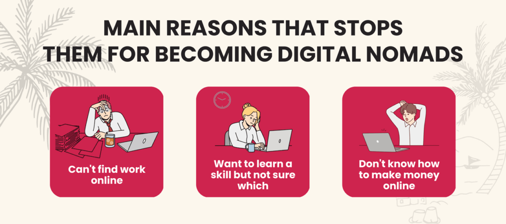
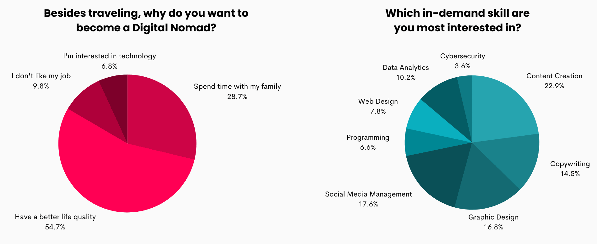
- They are looking for a better quality of life that allows them to travel while also achieving their financial goals.
- They have paid coaches who offer courses on learning to work remotely, but these turn out to be scams.
- They have tried to find work on freelancer websites but don’t get contacted or receive a lot of scams.

- The three most popular in-demand skills are Content Creation, Social Media Management, and Graphic Design.
- People prefer watching videos for informative content on topics they’re interested in, but they still read blog articles.
04
Persona
I used the information from my research to create a persona to visualize who I am designing a solution for.

05
Customer Journey
After defining who I am designing for, I created a customer journey map of Alejandra’s path to finding information about digital nomadism.
I used this Journey Map to identify areas of opportunity and turn them into ideas that could help my project.
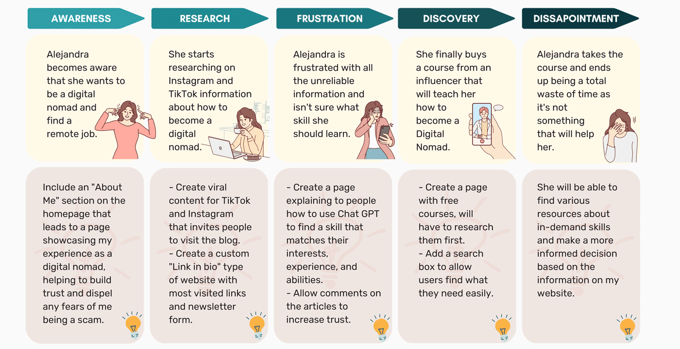
As part of my analysis, I also examined how Alejandra arrives at my website. I noticed that when searching for information on digital nomadism and seeking to learn more, she visits the “link in bio” on my social media profile.
This insight helped me to understand that it should be my priority to optimize my link in bio page and enhance the overall user experience.

06
Ideation Process
During my ideation process, I identified three main design challenges to tackle after analyzing Alejandra’s interactions with my website:
- How can I make better use of the link on my profile? (“link in bio”)
- How can I convert the traffic from my social media channels into more subscribers?
- How can I make it easier for people to find the information they need on my website?
To address these challenges, I decided to approach the redesign of my website as a holistic solution, focusing on the following three aspects:
- Redesign my “link in bio” page, as this is how she finds my website.
- Converting traffic into subscribers, as I constantly have visitors but not conversions.
- Making it easier for people to find the information they need on my website.
#1 Redesign my “link in bio” page
“A ‘link in bio’ is a hub for a user’s online presence, allowing people to showcase multiple links in one place. Platforms like Instagram and TikTok only allow users to display one link on their profile, making ‘link in bio’ pages important.
I was using Linktree, a popular platform for creating ‘link in bio’ pages, but it didn’t meet all of my needs. For example, I couldn’t include a subscription form. So, I decided to create my own ‘link in bio’ page instead.
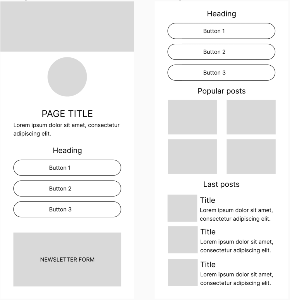
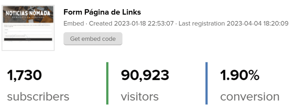
I incorporated a newsletter sign-up form with a travel-inspired design I created, attracting 1,730 subscribers during the first 3 months.
#2 Converting traffic into subscribers
During my research, I discovered that digital marketing skills are the top in-demand skills my users want to learn.
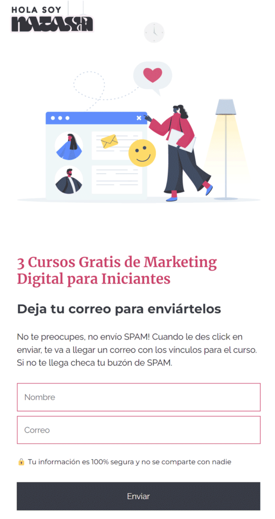
So I researched 3 free digital marketing courses for beginners and created a lead magnet with this information.
I designed a landing page and when people sign up they receive an email with the courses.
✉️ From January 1st to March 31st, this lead magnet has generated 3,788 subscribers.
I also created these two lead magnets based on several problems I identified during my research. They have gotten 150 subscribers during the first month.
One of the issues is that they can’t find jobs using freelancer websites. A possible solution is for them to use LinkedIn to offer their services. This lead magnet is a template for what to include in their LinkedIn profile.
Another problem I identified, tied to the issue of not finding work, is that they don’t know how to sell their services. So, I created this “Sales Script,” a step-by-step guide that tells them exactly what to say to their prospects when trying to sell their services.
✉️ From January 1st to March 31st, these 2 lead magnets have generated 969 subscribers.
#3 Helping people find information easier
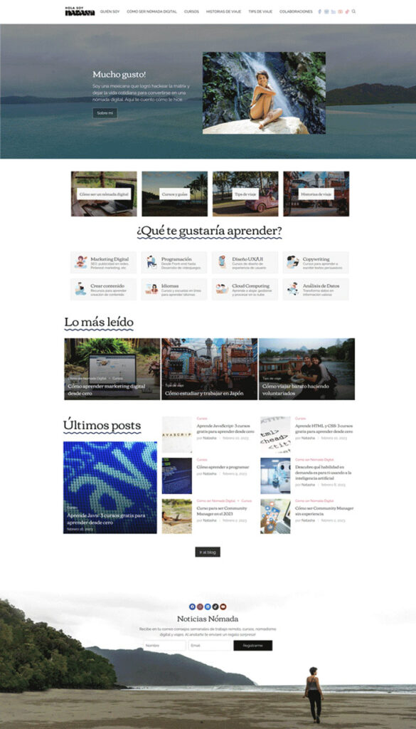
The original home page design consisted of six sections:
- A navigation menu that included the logo and social media links
- A hero header with a call-to-action (CTA) to visit the “About Me” section
- Four guides that I wrote about traveling and working remotely
- A carousel with popular articles
- The latest posts section
- A footer with social media links
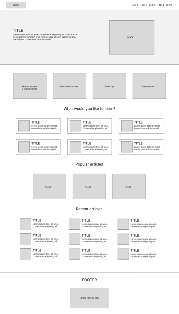
I made several design changes to my website.
I moved the logo to the left side of the header, added a new section for discovering new skills, replaced the carousel with three popular article cards, and added a section for my most recent articles.
Additionally, I designed a footer that includes a form to subscribe to my newsletter and links to my social media profiles.
✉️ From January 1st to March 31st, the footer form has generated 567 subscribers.
Lastly, to make sure that people can easily find what they are looking for, I added three search bars:
- On the navigation menu
- Links landing page
- Sidebar
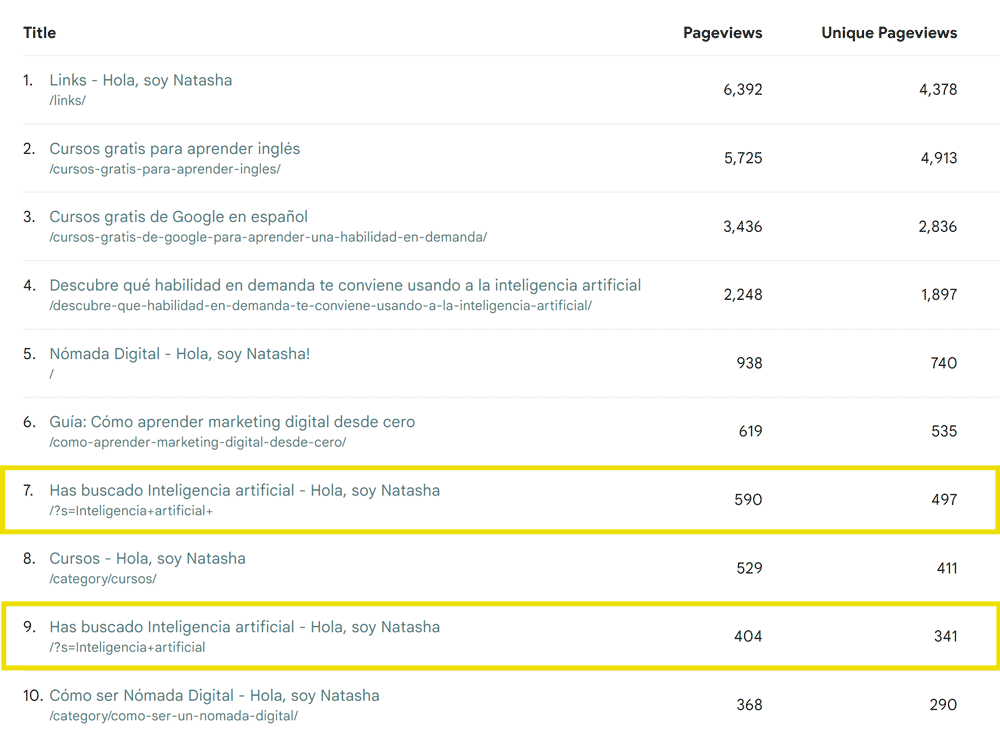
I’m thrilled with this decision because according to my statistics, people are using them.
Here are the top 10 most visited pages on my website during the first month of implementation. Number 7 and 9 are search queries that people made using my search bars.
I’m happy with the design of the page, however, the vast majority of my visitors access my site using their mobile phones.
So, I took the time to adapt my page to look good on mobile devices and tested it for any accessibility issues.
07
Design System
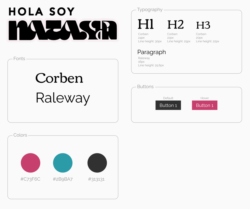
My Design System is not as complex as the one I made at Kupuri since I didn’t have to create components because I decided to use a WordPress theme. The colors and logo were made by graphic designers I had hired for my brand.
08
Design challenges when using a WordPress Theme
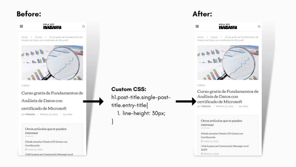
One of the main challenges I faced using a theme was that certain elements, such as the article titles, were spaced too far apart.
The design didn’t look good and could have made it difficult for users to navigate the content. To fix it I implemented custom CSS to make it appealing.
09
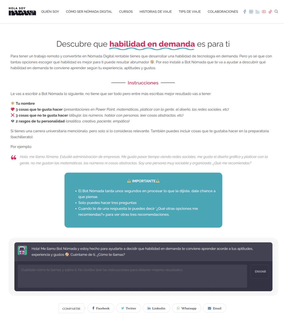
Chat GPT and Nomad Bot
One major issue my users face is not knowing which in-demand skill to learn.
To solve this, I installed a WordPress plugin that uses Open AI API (Chat GPT) on my website, allowing visitors to get personalized recommendations.
On the page, visitors are prompted to fill in their information and answer a few questions to get personalized recommendations based on their interests, abilities, and aptitudes.
10
Usability test: before and after
I tested my website with 6 different people through a Zoom video call. I also asked people on my social media to visit my site and do specific tasks.
When I first tested Nomad Bot with 15 people, it worked great and users loved it. However, I didn’t realize that Open AI API works with credits for queries, and after several tests, I realized I would need to buy more credits to keep using it.
Unfortunately, my website doesn’t have the budget for that. So, I wrote a guide on my blog to help people use Chat GPT to recommend 3 in-demand skills instead.
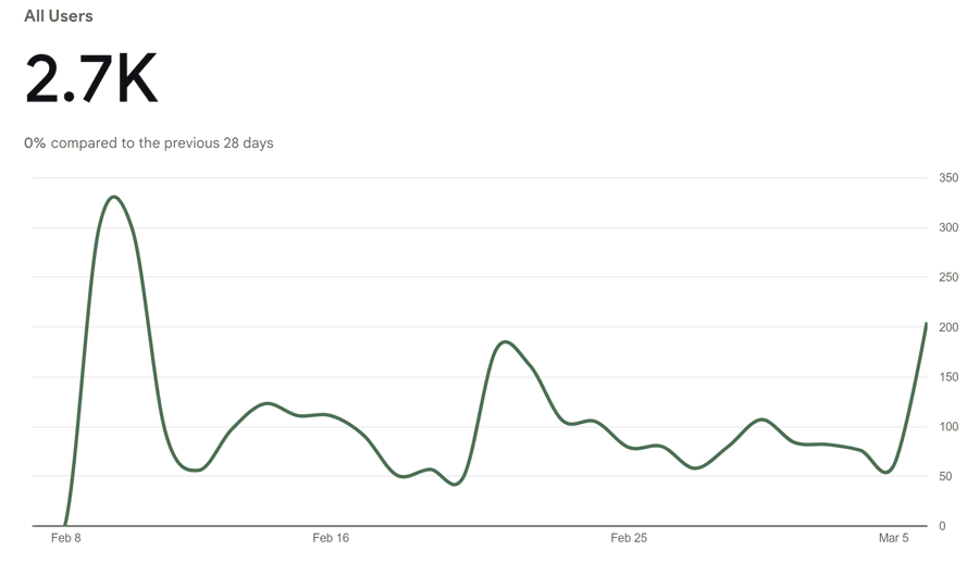
According to Google Analytics, during it’s first month it got 2,700 users.
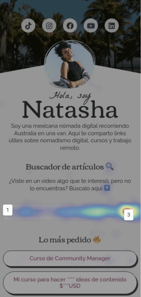
Originally, my link in bio page didn’t have a search form, but users said they couldn’t find the information mentioned in my videos.
So I added a search bar and now encourage visitors to use it. I’m happy with this change as it’s the most clicked item on my links landing page according to Hotjar data.
During my testing, I realized that people had difficulty finding categories within my blog.
I asked them to go to the courses section, but 3 out of 6 people were not able to do it on the first try.
This is how my navigation bar looked like, to get to the courses they had to go to my blog and select the “courses” category.
Therefore, I decided to put the categories in the first level of the menu. After several tests, I noticed that there was no longer any problem in finding the courses section.
11
What I learned
- Companies should pay more attention to their social media platforms as their main users are there. When conducting research, social media platforms are our best allies.
- I need to partner with someone to properly install Ads on my blog. The user experience is good, and I don’t want it to be ruined by ads.
- I want to add a much more advanced search method where people can search through filters. Searches are something that my users use, so I’m trying to see if I can do it with a plugin or if I’ll have to hire a develope
- Based on social media trends, one would imagine that people don’t read articles or don’t use their email anymore, but my research and implementation showed the opposite. That’s why we should never be swayed by what’s being said and we should always investigate our users.
- I am happy with the results obtained, now I can focus on continuing to grow and using my research to create appealing content for my users.


