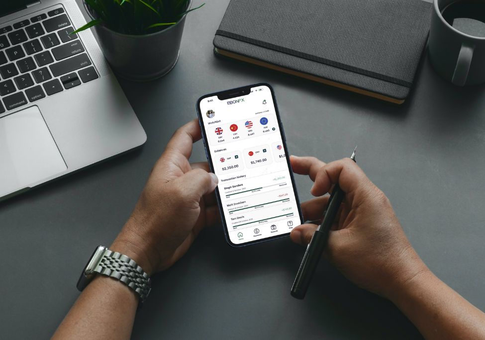
EbonFx
How might we design a streamlined platform that builds trust, and empowers users to make safe and secure international money transfers?
PUBLISHED
November 2022
TYPE
App
INDUSTRY
Finance
01
Roles
- UX Research
- UX Design
- Interactions Design
This was a team project for my 6-week sprint within a UX/UI Design Bootcamp at Academy Xi.
I was part of the secondary research team, designed the high-fidelity prototypes, and led the modifications to the app prototype based on user test insights.
02
Scenario
EbonFX, a Sydney-based company founded by financial market specialists, is a platform that specializes in facilitating foreign currency payments and managing the risks associated with foreign exchange transactions.
Goal
My team was tasked with designing a user-friendly and intuitive platform that will allow customers to easily navigate the complex world of foreign currency payments, while also addressing any concerns or pain points that current users may have.
03
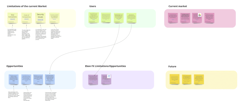
Secondary Research
The goal of conducting secondary research was to:
- Understanding fintech industry globally
- Examining forex market and Australian forex market
- Identifying consumer insights, behaviors, and decision-making patterns
- Investigating drivers of personalization in financial services
- Designing user-centered product for tech-savvy customers
- Aligning designs with industry trends and market demands
To do it we decided to divide the process into the following steps:
1. Identified research question. We started by defining our research questions.
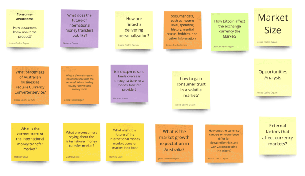
2. Identified research resources. We searched for existing research studies, reports, and articles that responded our questions.
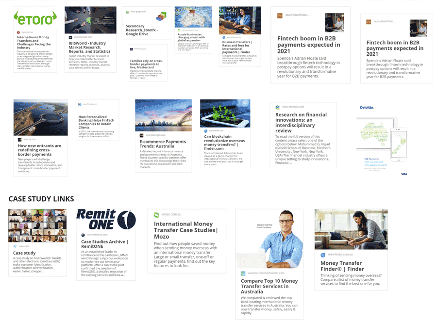
3. Collected data. Using the sources from our previous step, we answered our research questions and divided it by topics.
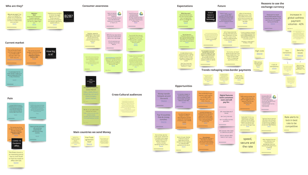
4. Analyzed Data. After gathering all the information, we synthesized our findings and looked for patterns.
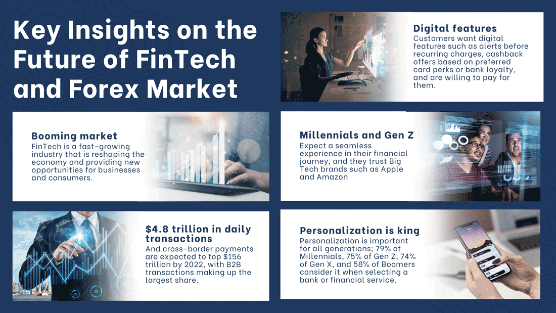
Secondary Research Insights
Thanks to this research, we were able to gain greater clarity on the Fintech and Forex market. I created this infographic with the most relevant findings for our solution, which covers from the market size to consumer preferences and expectations.
After gathering the research information, we passed it on to the relevant team to create a persona, which would help us develop the next steps of the process.
04
Design Process
We concluded that the best solution would be to create both a web platform and a mobile app.
Since we had limited time, we decided to divide and conquer. I was part of the high fidelity prototype team.
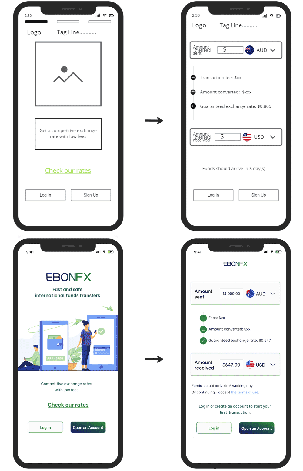
The wireframes team passed us this design to create a prototype and this is what we came up with:
On the first screen, users can log in, create an account, or compare rates.
It’s not necessary to log in to compare rates. This is so that users can see that our rates are competitive and that we’re a transparent and trustworthy platform.
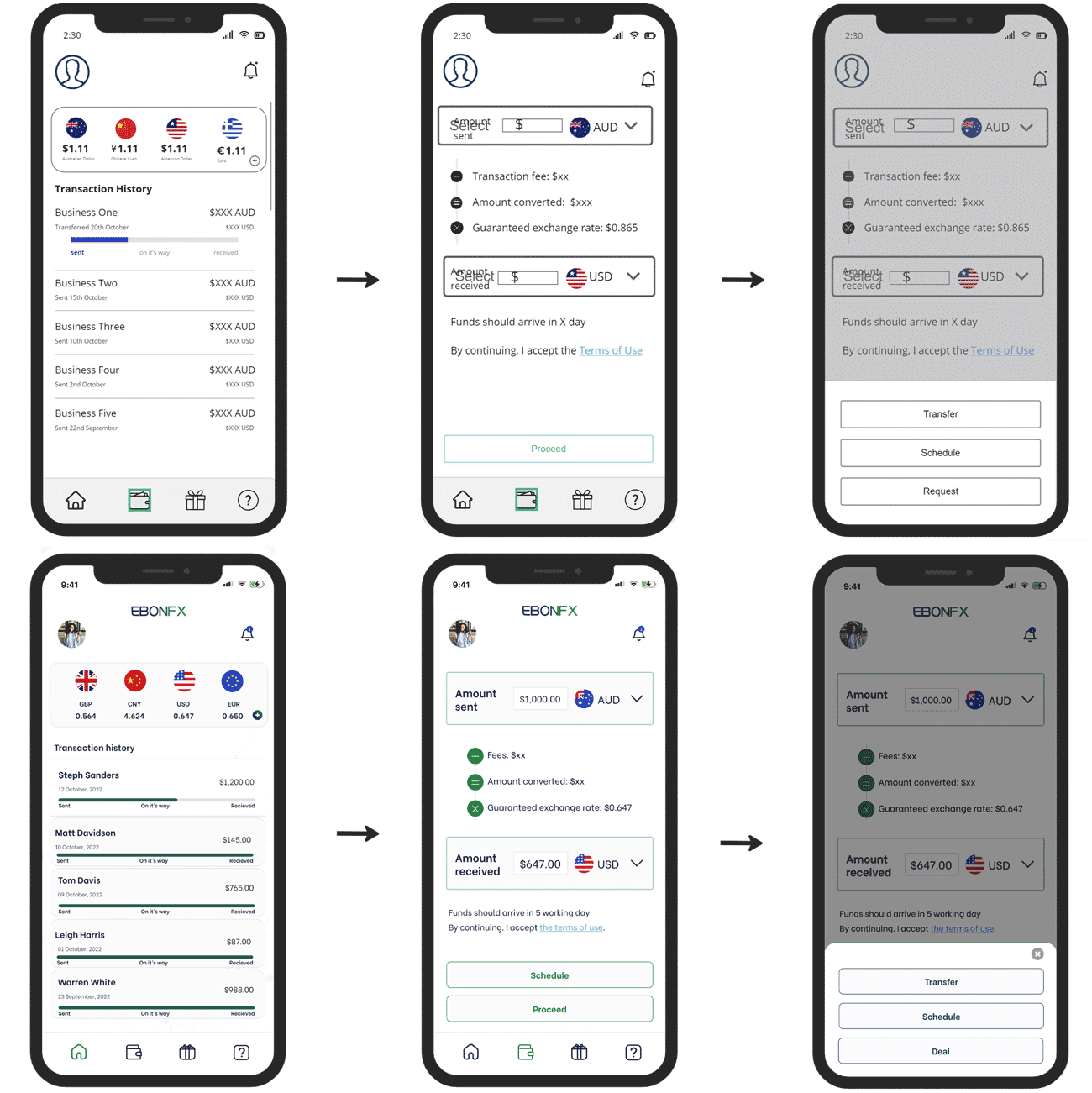
The first thing users see when they log in are the rates. They can also view their transaction history.
To make transactions, they click on the wallet icon, enter the amount they want to send, and immediately see the amount the recipient will receive in their currency.
They can then proceed to make the transfer or schedule it for a later time. The option to schedule transfers was added after feedback provided by the team that created the customer journey during one of our prototype review meetings.
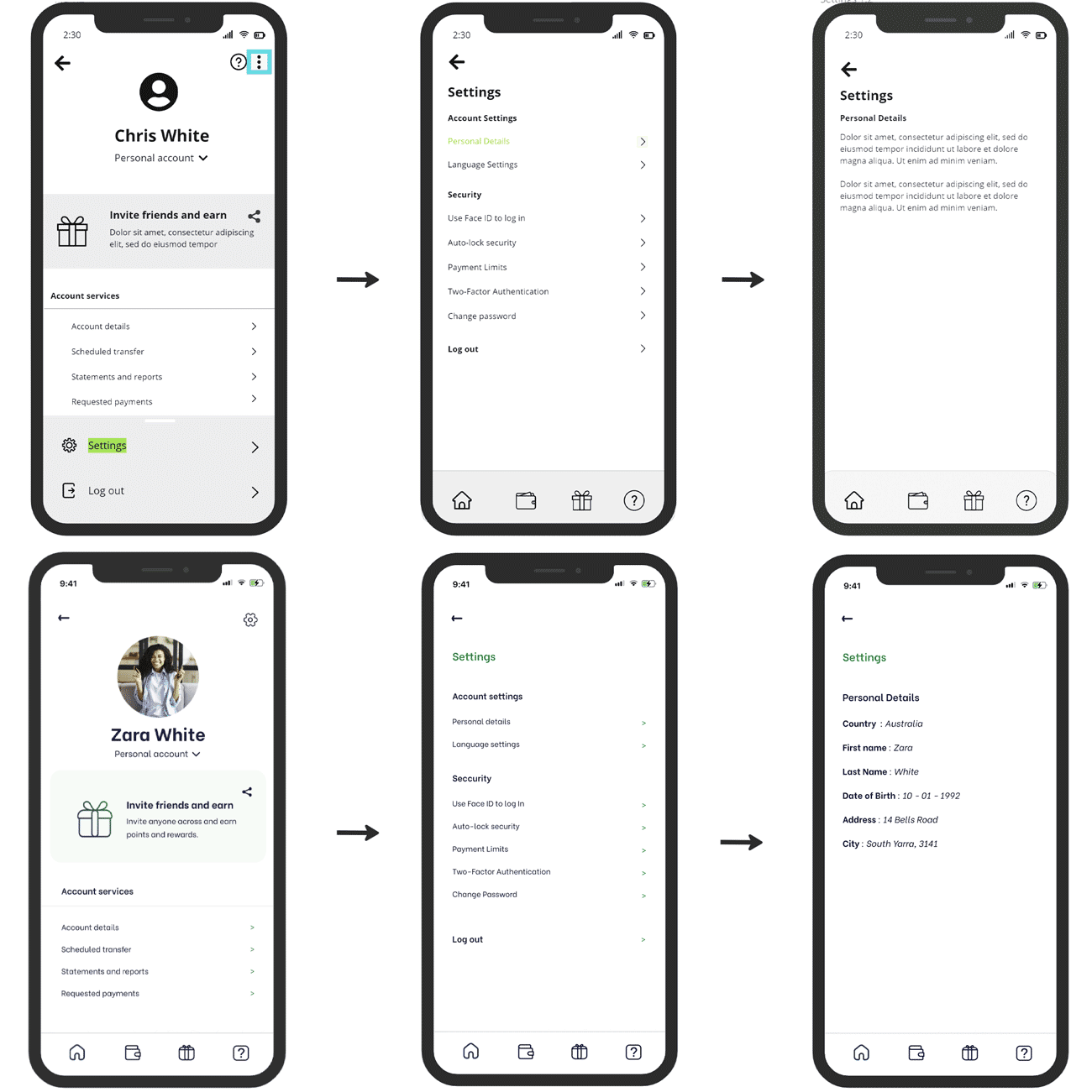
By clicking on the profile picture, users can access the app’s settings on the screen displayed.
To improve the layout and avoid a cluttered look, we made changes to the first wireframe, ensuring enough white space was left.
We replaced the kebab menu with a gear icon since it is more common to use a gear icon for settings.
We also eliminated the question mark icon that previously directed users to the information page, since the nav menu already includes this link.
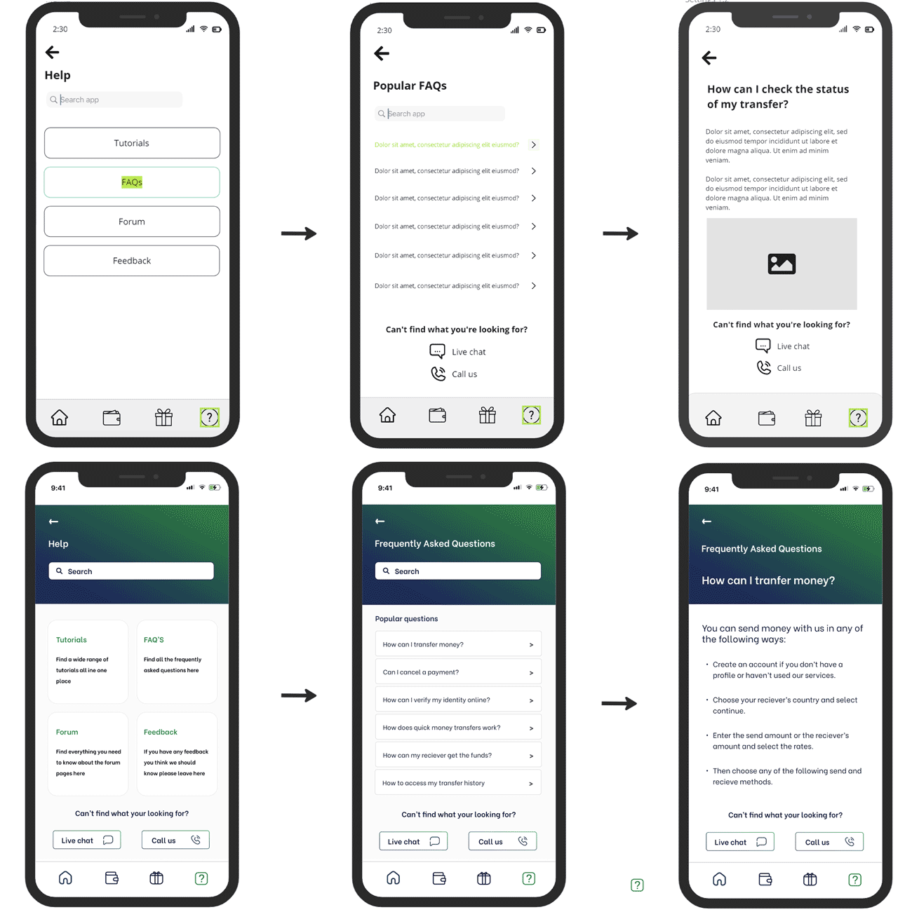
The question mark icon leads to the help center, featuring tutorials, FAQs, a forum, and feedback options.
We converted the chat and call us links into easy-to-reach, thumb-friendly buttons for quick assistance.
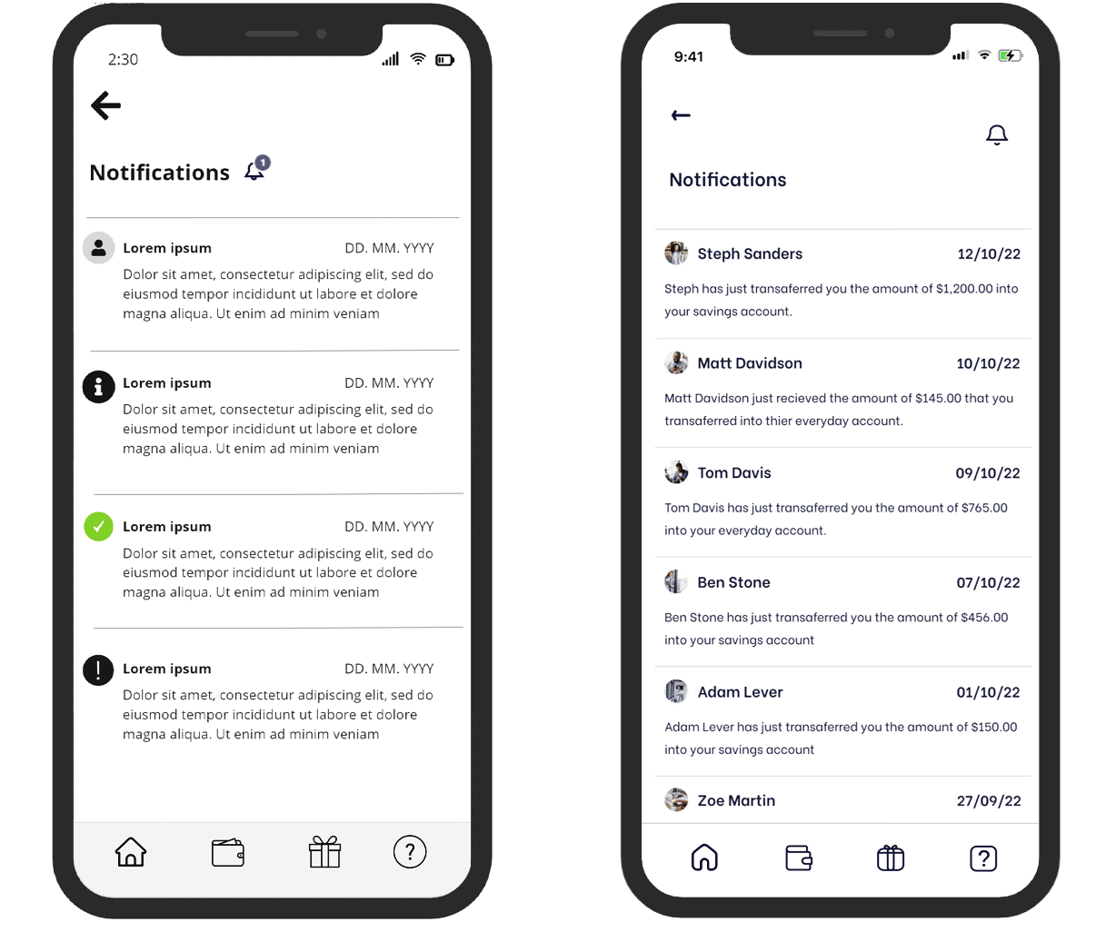
Lastly, we created the notifications screen. Here, users will be able to view notifications about transfers and system updates.
05
Usability test: Iterations
After testing the app with 6 participants, these were the adjustments that needed to be addressed. I led the iterations on the app and this is what we came up with.
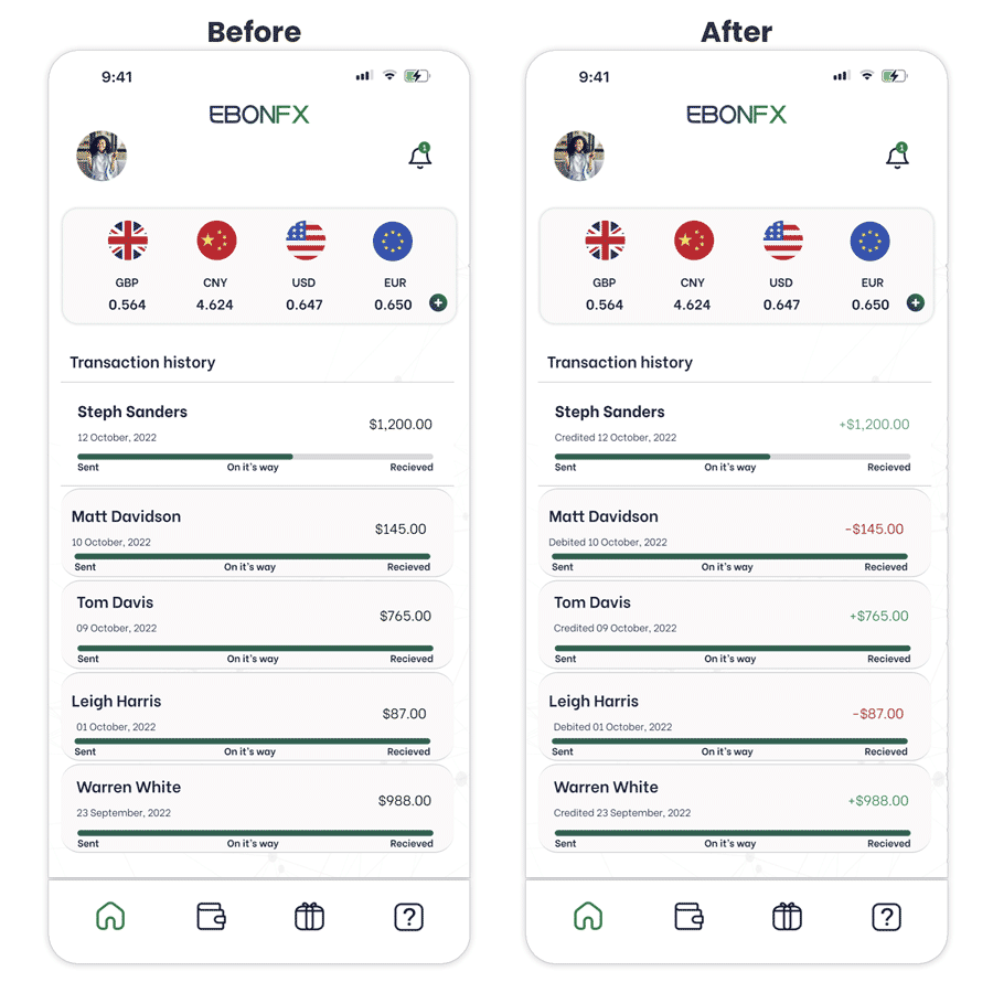
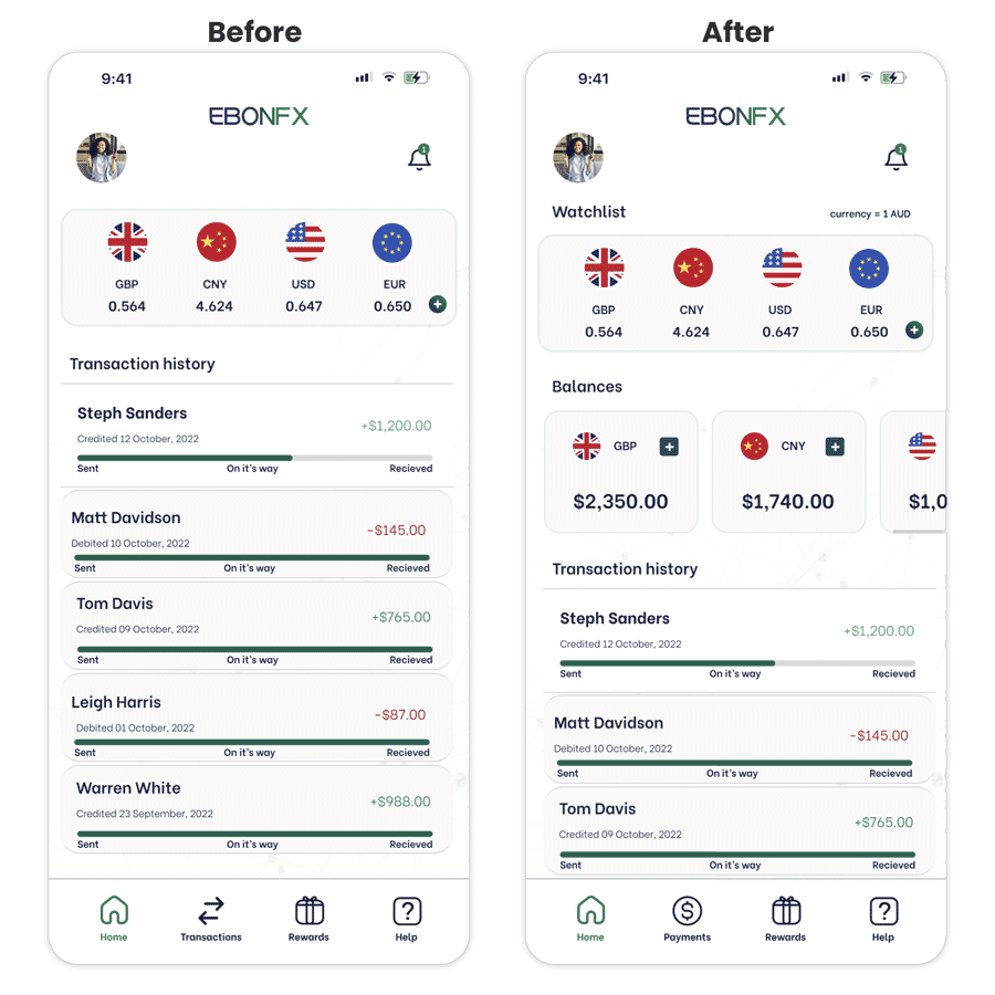
Users said that it was not clear whether the transactions were amounts that they had received or sent.
So we decided to specify “credited” or “debited” for each transaction next to the date.
And also to display credited transactions in green with a positive symbol and debited transactions in red with a negative symbol.
During user testing, one participant was uncertain about where to click to initiate payments and mistakenly believed that the transactions icon (a wallet) was intended for viewing their bank details.
Thay’s why we decided to change the icon and add labels.
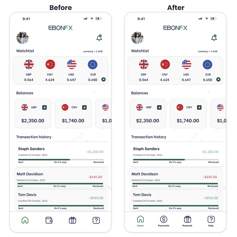
During the test a user said that they weren’t sure what currency they were at, so we added a currency conversion scale on the watchlist (currency=1AUD).
We also created a section to show account balances because a user said they would like to see their available funds.
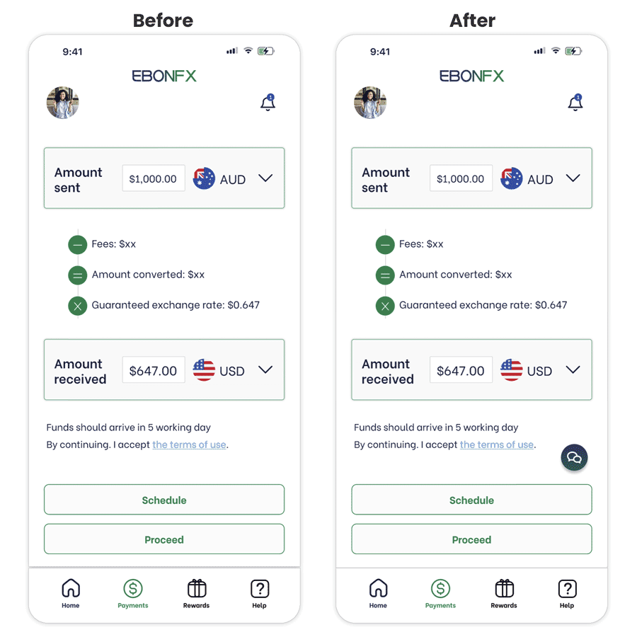
We decided to add a chat button to provide immediate customer support access after a user expressed the desire for such a feature in case they need assistance.
We also decided to implement a chat feature after a user stated the importance of feeling secure when making transactions in apps like EbonFx.
06
What I learned
- During the 6-week sprint on the EbonFX project, I learned how to work effectively with a large team.
- I used Miro to collaborate with everyone and enjoyed creating a Kanban board, holding votes, and using other features to manage the project efficiently.
- I particularly enjoyed adjusting the design based on usability tests, which improved the user experience and made the product easier to use.
- This project highlighted the importance of teamwork and collaboration to achieve success.
- I enjoyed the entire process and am excited to apply what I’ve learned to future projects.
